

Once more, with feeling
After a decade of blandification logo fonts are getting emotional again

What the logos you consume reveal about culture today. From blandification to the heritage revival and being human.
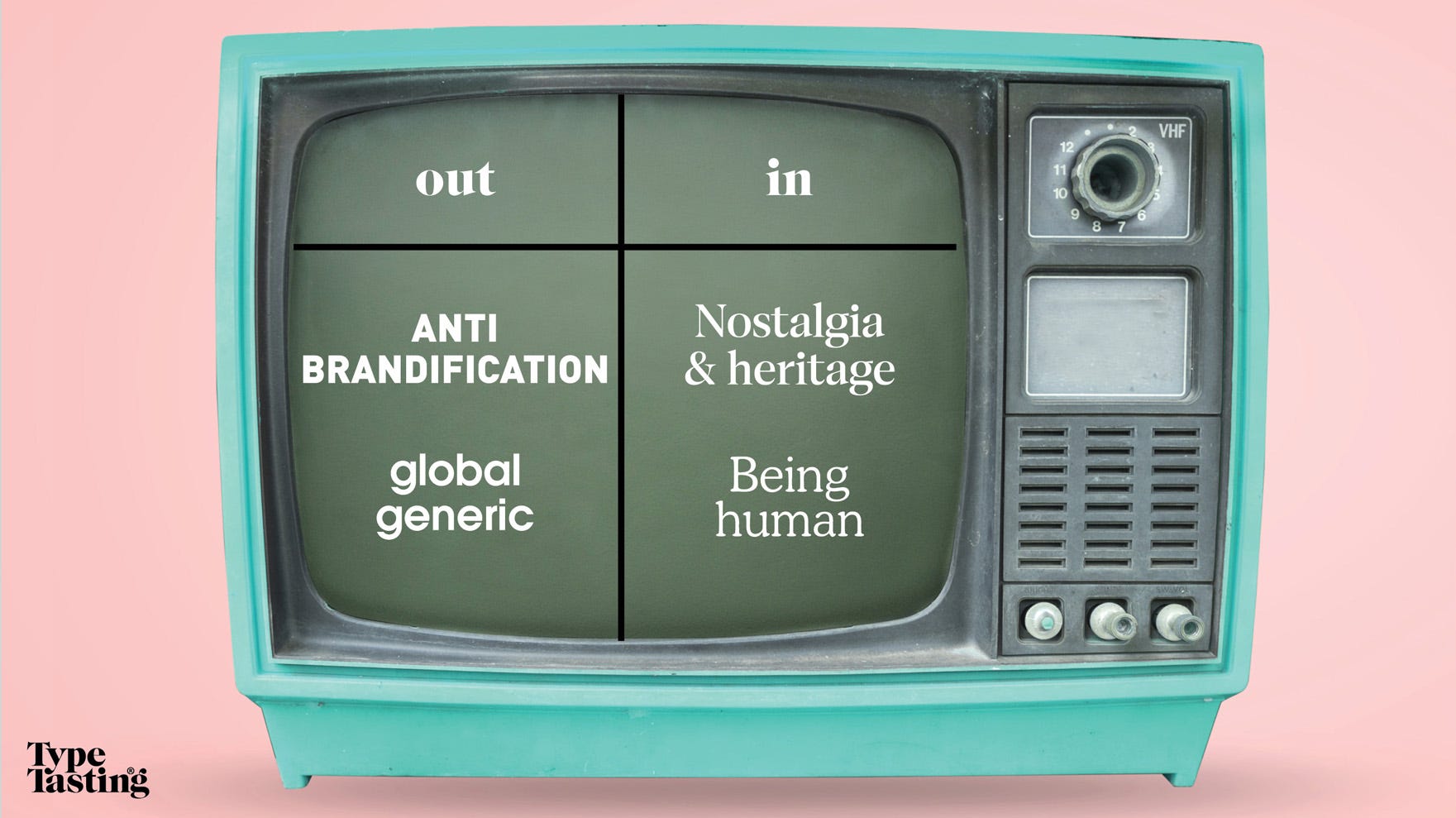
Big tech companies and luxury fashion brands are unlikely style partners. Yet, over the course of a decade an increasing number of brands from both sectors began to look stylistically similar. This is changing again now as each sector’s logo styles diverge once more. What do these parallel trends tell you about changing cultural attitudes? What do they reveal about the things we all care about today and what we’ll care about tomorrow?
Go back a decade and the old logos told you something about each brand. Tech logos felt exuberant as they told their origin stories. Luxury fashion logos felt expensive and ready to feature on the front cover of Vogue magazine.
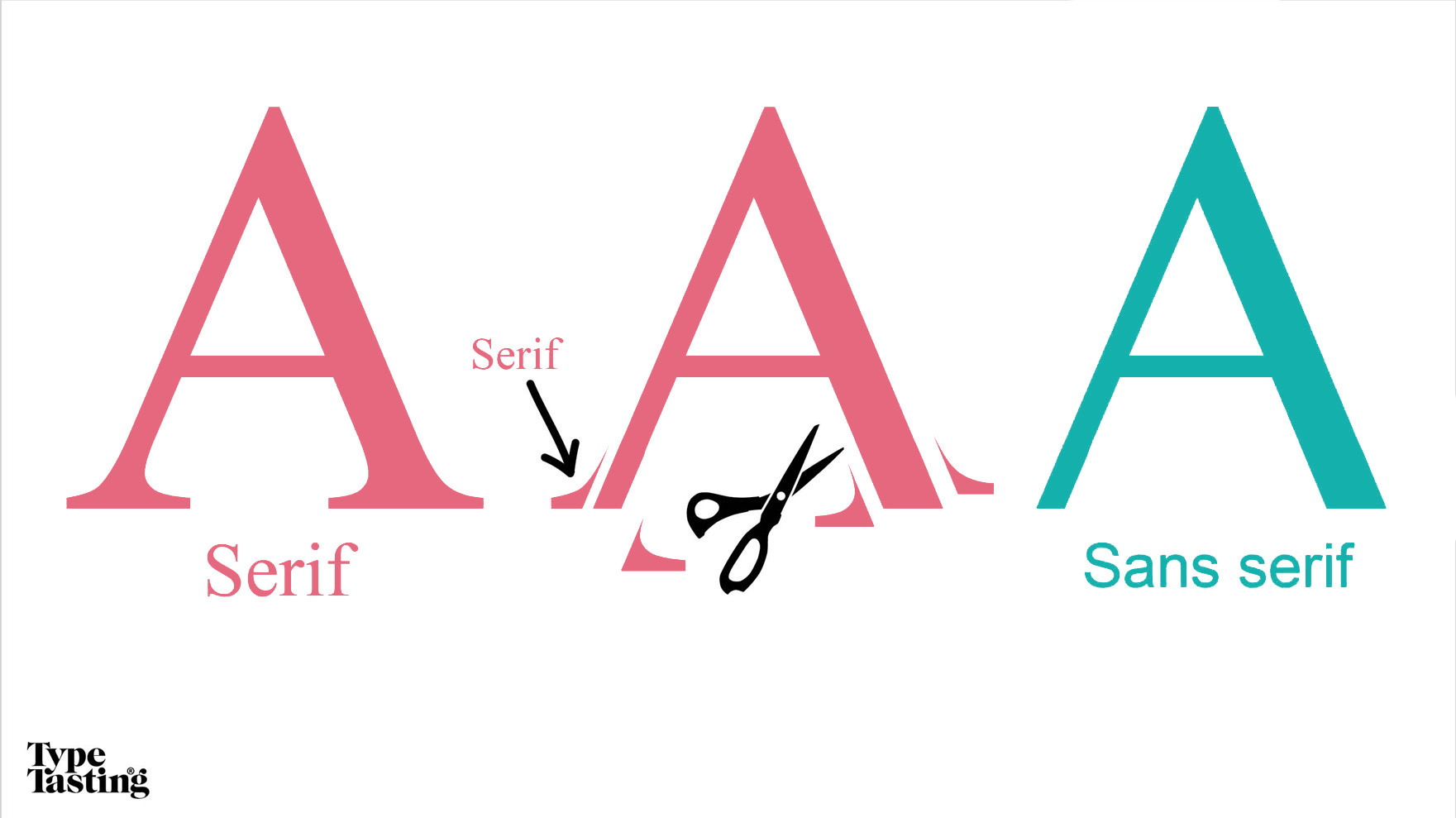
But then, one by one, the logos were redesigned. They became simple and minimal in a style 15-year-old Bella describes as “bold and blocky”. There were no unnecessary ornamental details such as the small feet-like details called serifs that have featured on printed Roman type since the late 1400s. These logos all used sans (without) serif fonts. But it wasn’t just the serifs that were discarded, they also relinquished their distinctive personalities. Minimalist logos rely on your knowledge of the brand to make that important emotional connection.
Of course, a brand is more than just a logo, it’s a whole system. I’m just looking at the logos for the purpose of these comparisons.
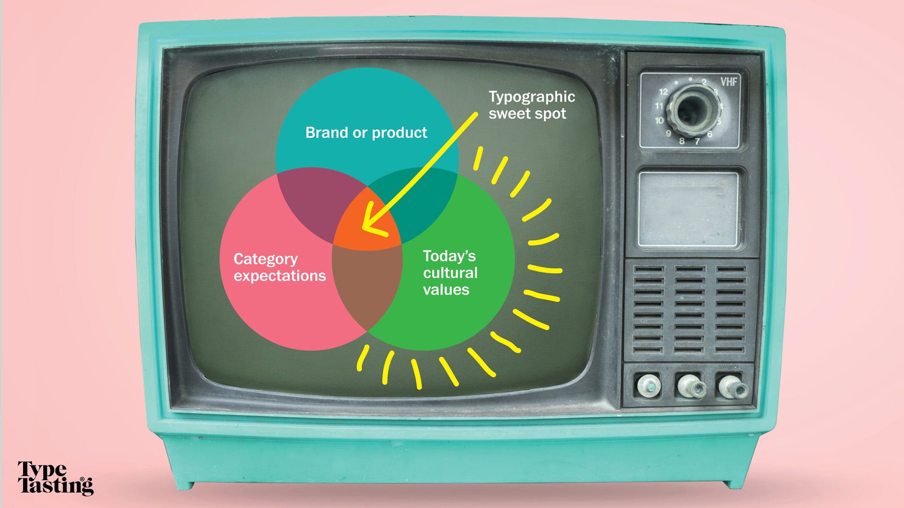
What the font’s going on?
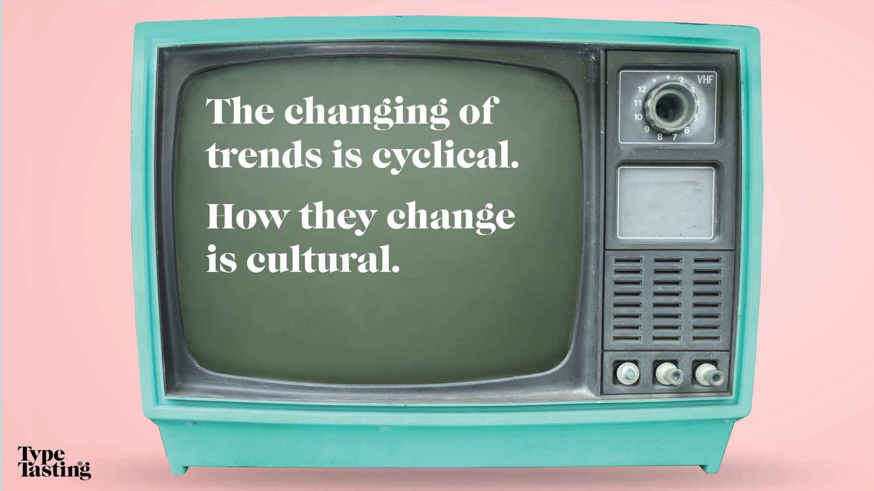
Logos and their fonts are cultural codes. They narrate changing attitudes and they document social change. The changing of trends is cyclical. How they change is cultural.
I’m often interviewed on this topic. This piece is inspired by the things I didn’t have time to say when I gave a talk and took part in a recent panel discussion at D&AD.
👀
1. Social media and big tech
From origin stories to being human
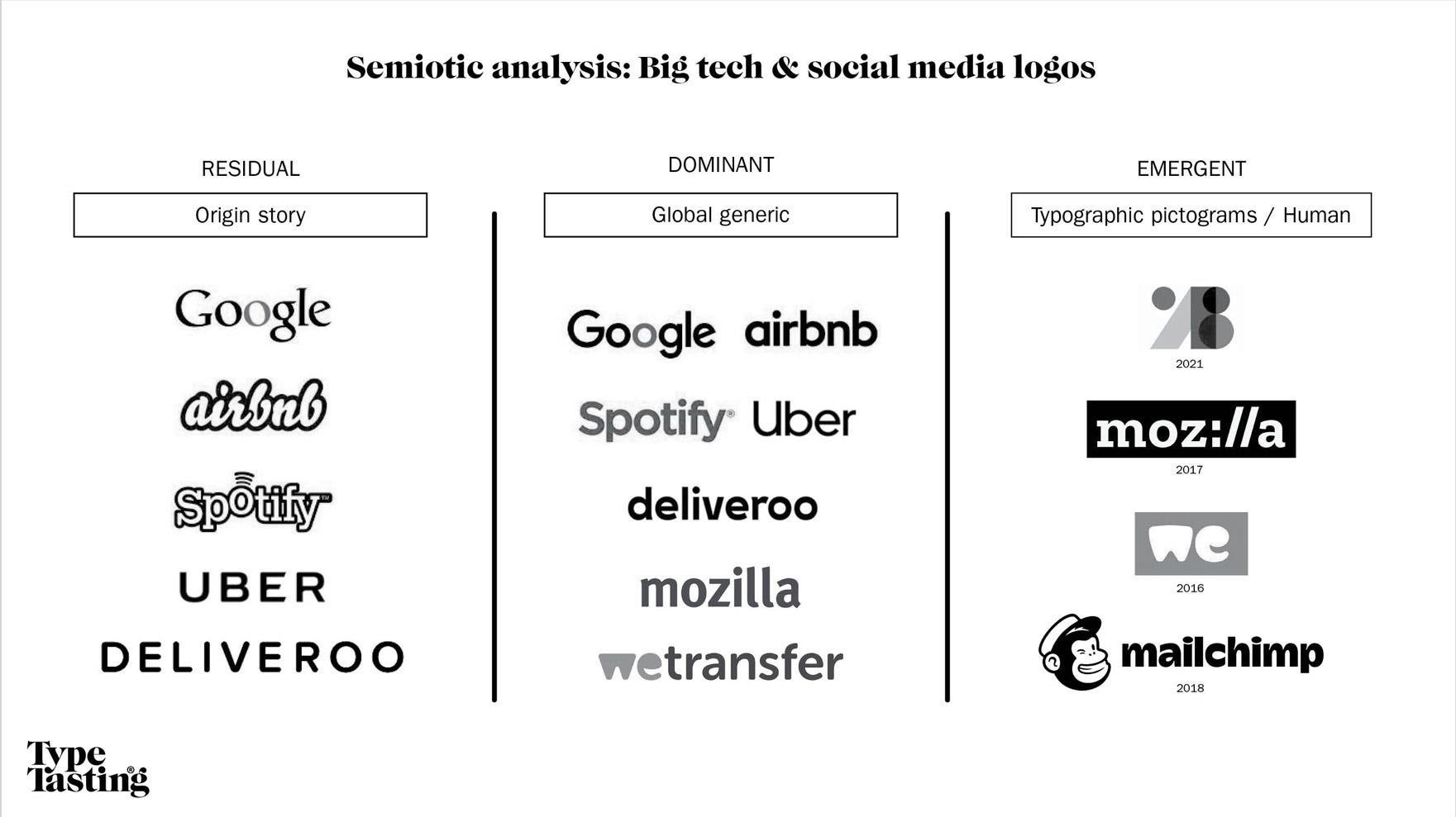
In the past: Origin story
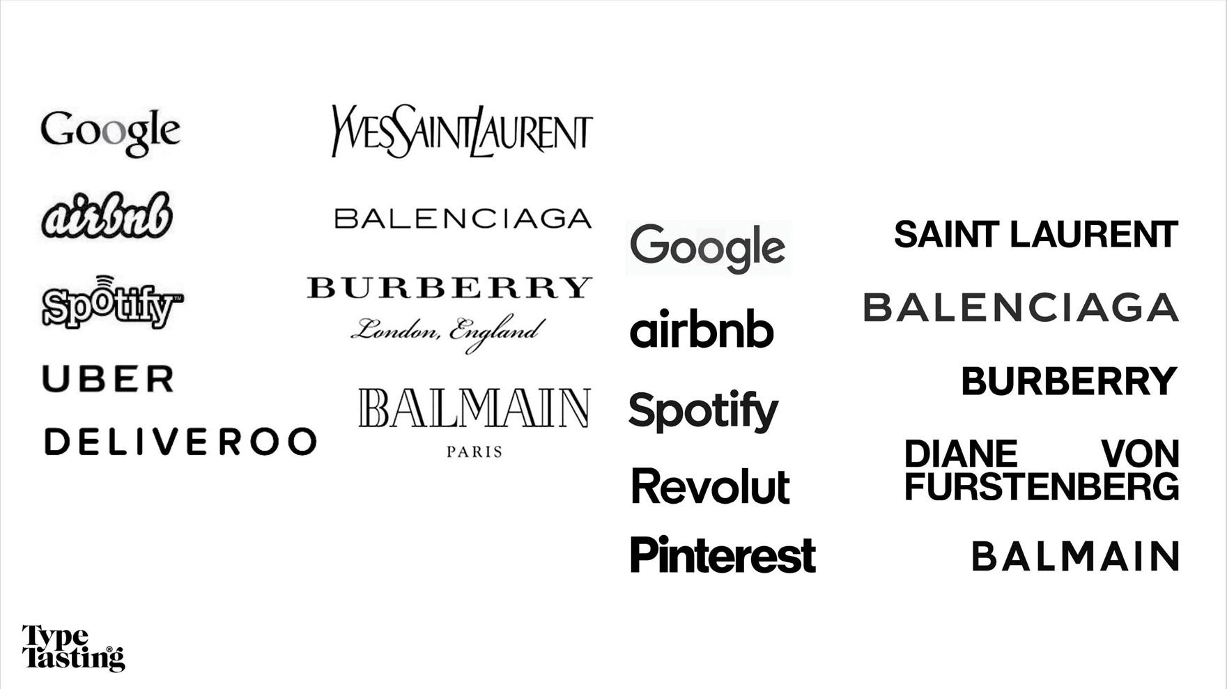
A decade ago social media and big tech companies were in their ascendance. They promised an exciting and utopian future. Social media was enriching and disruption was aspirational. Their logos told you their origin stories. Their naive and enthusiastic appearance mirrored how we felt about the new tech companies. The Spotify logo transmitted music; Uber was Sci Fi meets taxi; Deliveroo was friendly, easy and inexpensive; while Airbnb looked comfortably inviting to sleep on. I showed a group of children the old Google logo and they said the font made them think of “dictionaries and encyclopedias”. The fonts turned the words into stories.
Print magazine asked at a round table discussion why a company rebrands. Joe Wright of Sibling Rivalry explained that “Most often, a company will enter a rebrand process when it feels its visual voice no longer represents who it is. Perhaps society or technology has shifted around them.” Read the article here.
Dominating the present: Global generic
The logos changed over the next decade. The storytelling was replaced by a minimalist style best described as global generic. The geometric shapes and lower case letters felt friendly, wide-eyed and childlike. They suggested cute little futuristic robots saying “trust us with your data”.
They told a collective story of small companies that became so big and famous that they no longer needed to tell you who they were. The minimalist global generic style become shorthand for “we’re successful. We’ve made it. We’ve gone global” Soon every self-respecting new tech startup had a logo in this style, as if it was a shortcut directly to success.
The main reason given for the simplification of the letter shapes was that it would be more practical for small smartphone screens and low resolution computers. It was often argued that the minimalist logos would be more readable at small sizes. Yet, readability is not a primary requirement of a logo. Once you’re familiar with it you don’t read what the words say. You recognise a logo like an image from its shape and its colour.
Words and images are processed by different parts of your brain. Your brain has to work harder to process text, whereas it deciphers images almost instantly. MIT neuroscientists have found that you can identify images seen for as little as 13 milliseconds. “People think using pictures” writes John Berger in his book Ways of Seeing.
The minimalist sans serif trend is cyclical. In the 1950s it was a reaction against WWII. Society turned its back on anything old fashioned as people looked to the future. In the 2010s this trend has been a celebration of new technology businesses successfully disrupting the status quo.
The emerging future: Becoming human
The logo trend is changing again at a time when our reverence for social media and big tech companies is waning. Articles began appearing in 2017 saying “we’ve fallen out of love with Big Tech”. This has been fuelled the Cambridge Analytica scandal, echo chambers and culture wars, fake news, changing algorithms, Musk’s Twitter… Social media is less actually social than ever. Kyle Chayka writes in the New Yorker ‘The first major set of social networks have all decayed. They’d rather we looked at ads than talk to our friends.’
As we increasingly question the domination of big tech brands and their role in society the logos are starting to change again. Instead of the global generic style they are starting to tell stories again. Some feature typographic pictograms with visual clues to what the company does. Other brands are becoming more human and emotional.
Extra: ‘Once more, with feeling’ in graphs and numbers.
Numbers, data, graphs and geeky stuff for paid subcribers.
Click here.
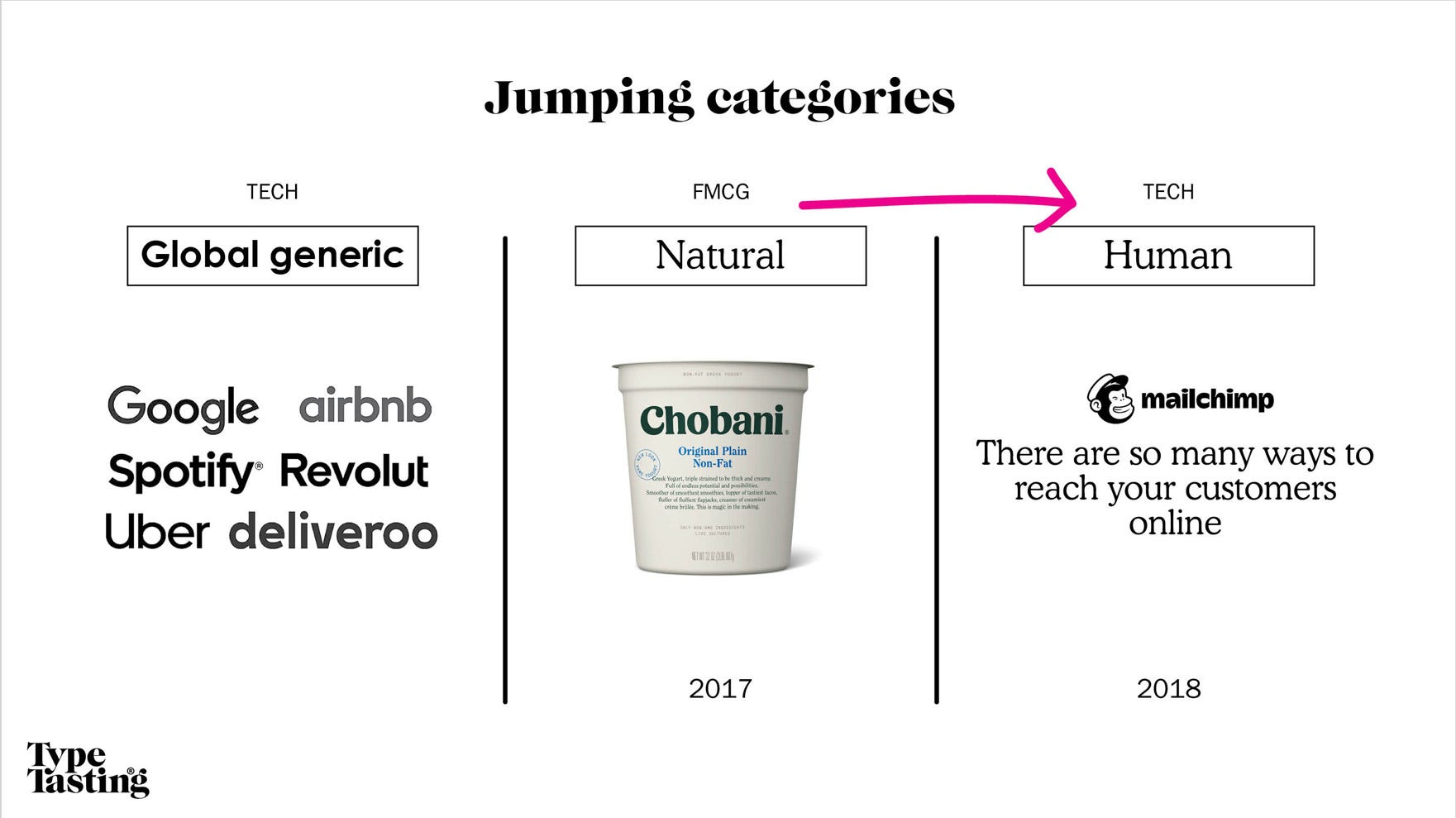
Email marketing platform Mailchimp broke with the global generic tech style in 2018. It’s rebrand was described as “outlandish”. The soft and curvy serif font looked to have taken inspiration from the Chobani yoghurt rebrand of a year earlier. The style jumped categories from the food aisle to the tech sector. It suits Mailchimp’s friendly and informal tone of voice well. The font is Cooper Light, which dates back to the early 1900s and it’s curvy serifs look like they’ve been painted with a paintbrush loaded up with paint.
I think more tech companies will move away from looking globally generic. Being authentic and human will become increasingly important with the march of AI and as our relationship with tech evolves.
👀
2. Luxury fashion
Out with the new, in with the old
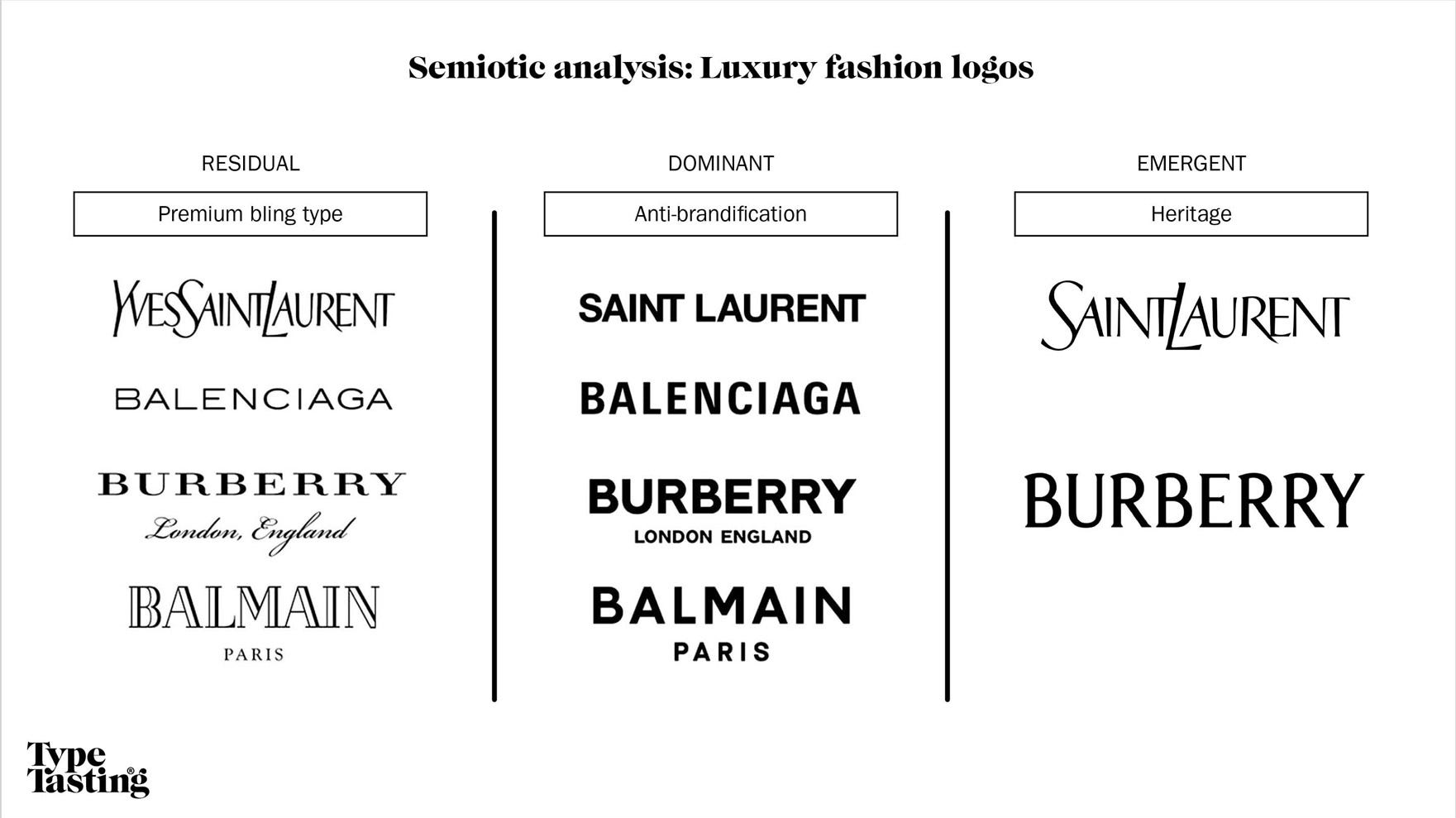
In the past: Premium bling
Typefaces are cultural codes. The fonts you consume reveal a great deal about the zeitgeist. Taking a closer look at luxury fashion logo trends reveals how attitudes towards wealth are changing.
Luxury fashion brands both reflect style and also tell you what’s stylish. A decade ago fashion logos were the epitome of luxury. The letterforms themselves looked like the little black dress of the font world. They had refined contrast, often featuring fine hairline serifs that added that perfect finishing touch to an outfit. You could imagine them on the front cover of Vogue magazine or breakfasting with Audrey Hepburn at Tiffany’s. Wealth was aspirational and they were typographic show-offs. The logos were literally showing you the money.
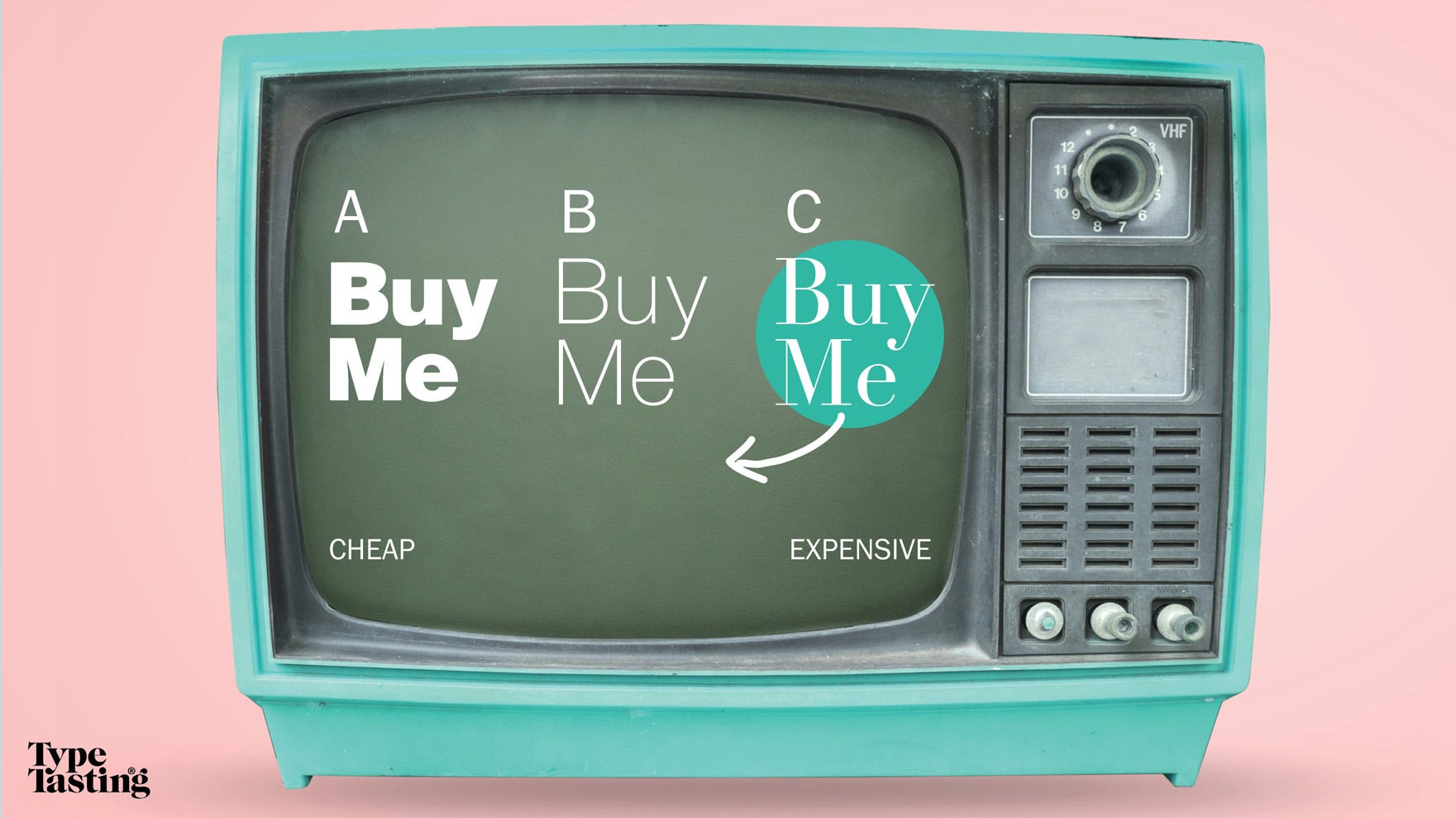
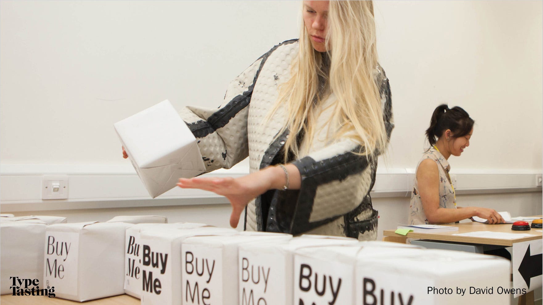
In 2015 I took the Pop-up Typography Lab to the Victoria and Albert Museum as part of the London Design Festival. In one of the experiments I asked participants to arrange boxes with he words ‘Buy Me’ in order of the cheapest to most expensive. At the time there was a clear winner. It was C. This is the style widely associated with fashion and luxury.
AIGA wrote an article about this experiment in 2015.
Read the article here.
But that was then. Fashions are cyclical and tastes change. I’ve continued to run a version of this experiment at events, which I call the ‘Price (of the Typeface) is Right’. From 2019 the results began to change and the ‘bling’ fashion font began to slide down the scale.
Extra: ‘Once more, with feeling’ in graphs and numbers.
Numbers, data, graphs and geeky stuff for paid subcribers.
Click here.
Dominating the present: Anti-brandification
Over the course of a decade a collection of luxury fashion brand logos ditched their quintessentially ‘fashion’ fonts. One-by-one they adopted the neutral sans serif style. In contrast to the lower case and friendly tech logos these were bold and upper case. They were saying “look at me” and demanding your attention.
The old premium bling fashion fonts reflected a time when wealth was aspirational. Over the last decade we’ve become increasingly uncomfortable with ostentatious shows of wealth according to trend forecasting agency WGSN. They observe that conspicuous markers of wealth have become increasingly at odds with the global population. In light of this it’s not surprising that luxury fashion brands would change. What has surprised many is how the logos, the main flag bearer of a brand, started to feel similar. Fashion is about self-expression not about looking the same.
I spoke to semiotician Amelia Boothman about this homogenisation of luxury fashion logos. She explained that the anti-brandification of brands is a reaction to the materialistic world that brands have represented over the last decades. It’s a design style that’s been seen across premium brands not just the fashion world.
The emerging future: Heritage
Today logos are shape shifting again as the things we care about change. The headline is that the domination of sans serifs is coming to an end. Type designer Charles Nix describes this as “the waning end of a supertrend”. Saint Laurent announced the new summer season with a version of their old logo designed by Cassandre in the 1960s. Burberry recently unveiled their new brand designed to debut “the heritage brand’s new ode to Britishness”. The new wordmark features serifs. It references typefaces used previously by the brand with other references to its historical roots. Emma Tucker writes in Creative Review that serifs are finally back in fashion “after years languishing at the side of the proverbial dancefloor.”
We’ve been living through a time of unprecedented challenges and it’s easy to feel uncertain about the future. The past offers that warm comforting hug of familiarity and feeling of security. Clay Routledge, a psychological scientist writes that revisiting cherished memories can be a way to cope with stress. “Nostalgia is one of the self-regulatory tools we use to remind ourselves that we matter”.
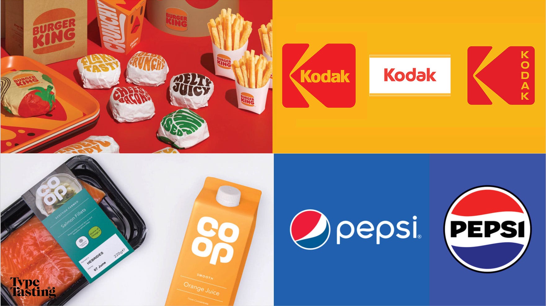
It’s not just fashion logos embracing their heritage. The return of nostalgia is in as can also be seen in recent rebrands by Burger King, Kodak, Coop and Pepsi. During the first Covid lockdown, Spotify reported a 54% increase in searches for ‘oldies’ or ‘throwback’ with a surge in nostalgic playlists.
When brands get it wrong
Brands don’t always get this right. Whether they’re out of sync with the mood of their audience, or they’ve made the change at the wrong moment in time.
Kirsty Minns of Mother Design explained that “Brands need to remember that it’s impossible to please everyone, and sometimes being polarizing is the way to go. It gets you noticed and avoids the fatal mistake of falling into a ‘blanding’ space. But if you want to ensure your rebrand is as well received as possible, you must communicate.” (Print magazine round table discussion).
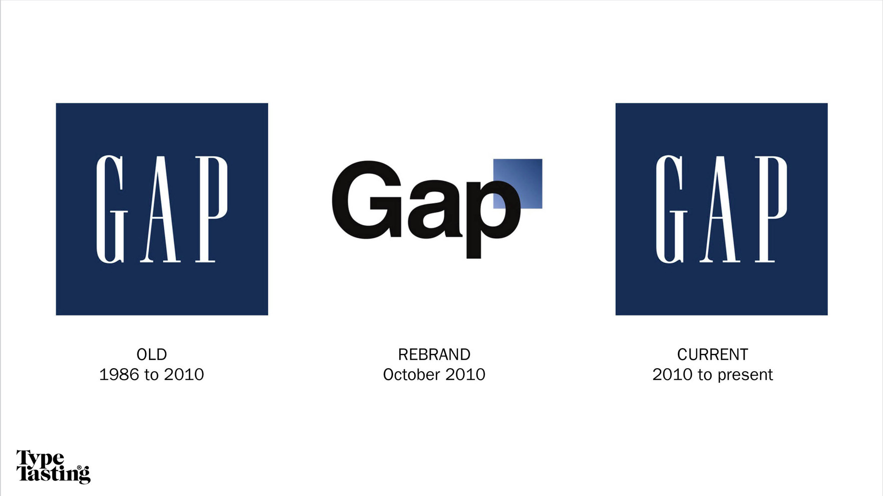
In 2010 Gap changed their logo from a version of Premium bling lettering to the most famous sans serif typeface of all, Helvetica. But this caused outcry as customers complained that the new logo looked “cheap” and “tacky”. The new logo lasted just a few days before Gap returned to a version of their previous logo. Gap isn’t a luxury fashion brand so it has a different relationship with its customers. The new logo (shown in the middle) would have placed it in the discount aisle of a supermarket. It was also before the luxury fashion brands declared anti-brandification to be an aspirational style.
“I feel like this is a classic case of a change for the sake of change, not a change underpinned by insight and strategy. It feels naive and confusing. I’m actually surprised it lasted as long as it did!” observed Joe Wright of Sibling Rivalry. (Print magazine round table discussion).
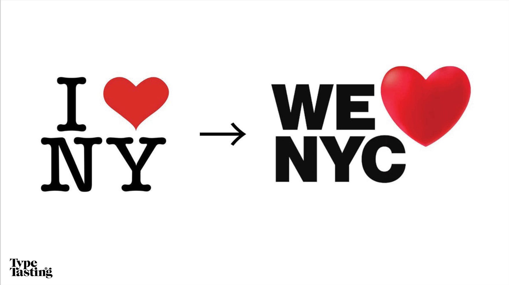
This year’s new We love NYC logo feels like a feat of reverse nostalgia. It’s arrived at the sans serif party just as the cool crowd is leaving and has caused outrage among New Yorkers. The story even made it into the Daily Mail and Fox News, not publications you would expect to feature typography. (It’s worth adding that the logo is not a replacement for Milton Glaser’s iconic 1976 logo.) Like the London 2012 Olympics logo, it has challenged a city’s sense of identity.
Asked why a brand redesigns Ali Marmaduke of Bulletproof explained that “Whatever the reason for redesigning, brands must ensure that they’re timely— adapting to evolving culture. But it needs to be timeless too; it can’t be a rushed reaction that doesn’t provide longevity and familiar brand cues.” (Print magazine round table discussion).
Typography narrates culture
Taking a closer look at logo trends reveals a great deal about the things we all care about today and what we’ll care about tomorrow. Typefaces are cultural codes, which narrate changing attitudes and document social change.
👀
Would you like to learn more?
Book a workshop, facilitation session or a visit to my studio if you’d like to find out more.
👀
This was super interesting. Thank you.
Great post! Thank you for sharing all of this 🙌