The Sensologists: The (occasional) design edition curated for Type Tasting subscribers
⭐ Bite-sized, cutting-edge insights on how multi-sensory science is reshaping design. ⭐ A special Type Tasting edition from The Sensologists briefings.
This special design edition curated for Type Tasting subscribers explores the shifting landscape of design, where senses, psychology, and technology collide.
From wine labels that change how a sip tastes to curly fonts that became cultural clichés. These stories reveal how design shapes memory, emotion, and trust. You’ll find insights into why visual storytelling sells food. Why offline retail is becoming a multi-sensory refuge. And how silence might be the next frontier for wellbeing. There are reflections on AI as a creative material. The enduring pull of craft. And what typography says about our culture and choices.
This is design through the lens of multi-sensory thinking. Not just a visual style, but an invisible influence that guides what we buy, feel, and remember.
In this briefing:
🔘 Wine labels and taste psychology
🔘 Storytelling you see, not read
🔘 Black Sabbath’s legendary typefaces
🔘 The Substack AI report
🔘 Andy Warhol’s vs new technology
🔘 Speculative future Silence Experience Designer
🔘 In-person retail as online backlash
🔘 How to measure return on experiences (ROX)
🔘 WeTransfer’s IP clarification
🔘 Should designers train AI models?
🔘 The font that became a wedding cliché
🔘 Craft, memory and the future of typography
🚀 For Type Tasting paid subscribers interested in the intersection of design, communication, multi-sensory research and innovation.
🚀 Get in touch to book a talk or workshop with Sarah Hyndman on applying Multi-Sensory Thinking as a process.
A collaboration with The Sensologists.
DESIGN & PSYCHOLOGY
Wine labels
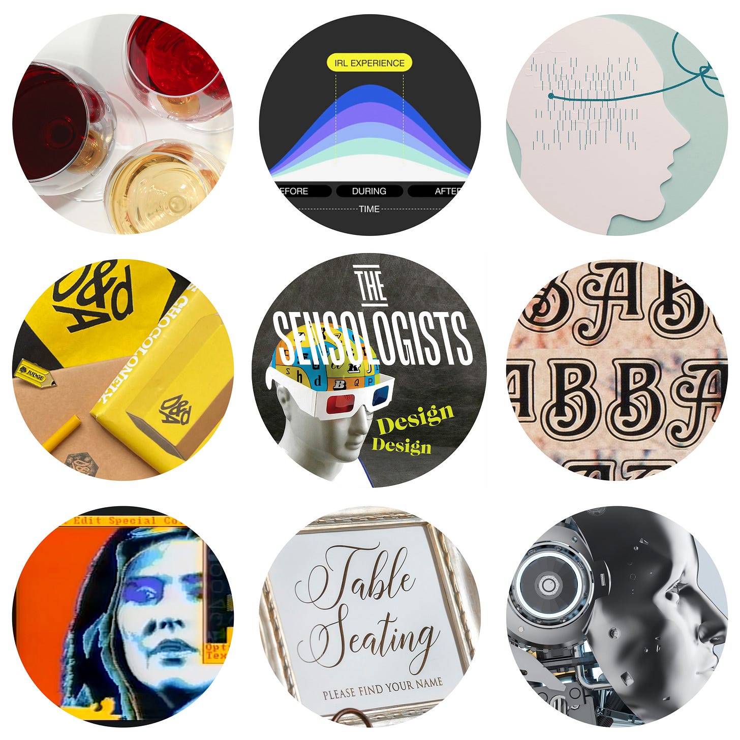
🔘 Beyond branding: The cognitive and emotional influence of wine label design
Wine labels influence what we expect to taste and how we feel about the wine. The article explores studies showing how typefaces, colours and images trigger shared meanings like ‘premium’ or ‘traditional.’


