

Published study. The Taste of Typeface
By Carlos Velasco, Andy T. Woods, Sarah Hyndman (Type Tasting), Charles Spence (University of Oxford), iPerception, August 2015

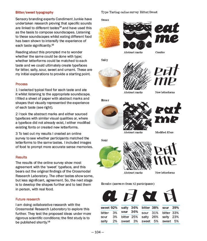
This study began with an idea to identify the letter shapes associated with different shapes. I created letter shapes inspired by my experiences of eating sweet, bitter, sour and salty tasting food samples.
I drew abstract marks while I ate each food sample and then found letter shapes with similar visual qualities. I then created a survey to find out whether others agreed with my shape pairings. I later wrote about this exercise in my book Why Fonts Matter (above). I then teamed up with Carlos Velasco, Andy T. Woods and Professor Charles Spence to develop the idea and to publish our findings as a study.
Abstract
Previous research has demonstrated that typefaces can convey meaning over-and-above the actual semantic content of whatever happens to be written. Here, we demonstrate for the first time that people match basic taste words (sweet, sour, salty, and bitter) to typefaces varying in their roundness versus angularity. In Experiment 1, the participants matched rounder typefaces with the word “sweet,” while matching more angular typefaces with the taste words “bitter,” “salty,” and “sour.” Experiment 2 demonstrates that rounder typefaces are liked more and are judged easier to read than their more angular counterparts. We conclude that there is a strong relationship between roundness/angularity, ease of processing, and typeface liking, which in turn influences the correspondence between typeface and taste. These results are discussed in terms of the notion of affective crossmodal correspondences.
Introduction
Recently, a growing body of research has demonstrated that people match taste and flavor stimuli (as well as taste or flavor words) to shapes in a manner that is consistent across individuals (e.g., see Wan et al., 2014; see also Spence & Deroy, 2013, for a review). The roundness/angularity (RA) of shapes appears to be a key element in the crossmodal matching of tastes to shapes (Velasco, Woods, Deroy, & Spence, 2015a). Research on the “crossmodal correspondences” (the name given to the initially surprising tendency to match seemingly unrelated information across the senses, see Marks & Mulvenna, 2013; Spence, 2011) between tastes and shapes is of particular interest to designers and marketers, as design elements such as logos, labels, visual imagery, and typefaces can potentially influence a consumer’s expectations concerning food and drink products (see Spence, 2012, for a review).
Typefaces are particularly intriguing in this regard, as they can take on a number of different forms and can convey meaning over-and-above the actual semantic message of the text itself (e.g., Doyle & Bottomley, 2009; Morrison, 1986; Poffenberger & Barrows, 1924; Tannenbaum, Jacobson, & Norris, 1964). Indeed, it has been suggested that the visual features of written words can be processed before their actual meaning and that this can influence subsequent information processing (e.g., Childers & Jass, 2002, see also Celhay, Boyselle, & Cohen, 2015). In the context of consumer behavior, this may be of particular importance given that consumers perceive fonts as being more appropriate for a given product when both the product and the font have the same connotative meaning (e.g., Doyle & Bottomley, 2009, as measured using the semantic differential technique; see Osgood, Suci, & Tannenbaum, 1957). In addition, the semantic appropriateness or congruency of a product has also been shown to influence people’s choice behavior (Doyle & Bottomley, 2004, see also Doyle & Bottomley, 2006; 2011). This, in turn, points to the importance of considering font-product semantic consistency in design. Here, we propose that congruency can also be applied to the relationship between typeface and taste. Design practitioners have already suggested that typefaces may be used to convey information about taste or flavor (Hyndman, 2015).
Research on the topic of crossmodal correspondences suggests that the RA of typefaces can be associated with specific taste words (in a forced choice setting). For example, Velasco, Salgado-Montejo, Marmolejo-Ramos, and Spence (2014) recently reported that fictional packages with a brand name that had a rounder typeface (e.g., Swis721 B1kRnd BT—Black, 44 pt) were more frequently categorized as sweet as compared with packages with a more angular typeface (e.g., Hollywood Hills—Regular, 53 pt), which was more frequently categorized as sour instead. Potentially, the RA dimension studied in research on shape-taste correspondences can be extended to typefaces.
In the present study, we wanted to investigate whether the different design elements of typefaces (RA, bold, italics, and orientation) would influence participants’ associations to specific basic taste words (bitter, salty, sour, and sweet). Based on the aforementioned literature, the clear prediction has, at least, to be that rounder typefaces would be associated with the word sweet. In Experiment 1, we assessed any relationship between taste words (bitter, salty, sour, and sweet) and different typefaces. Experiment 2 was motivated by previous research suggesting that taste or shape may be thought of as affective correspondences (Velasco et al., 2015a), and that there is a relationship between processing fluency and liking (Winkielman & Cacioppo, 2001). Here, we assessed whether the different typefaces would be consistently rated along RA, as well as liking, and ease of processing scales.